Smart Games
Player and admin-facing flows and UI/UX for a US-based gaming and marketing platform: including custom games, coupons and payments.
The context
SmartGames is a US-based platform that combines gaming with brand engagement. Businesses can build a custom or template game, place coupons and ads inside it, target where those run, and track redemption: all from a single admin panel.
The product was conceptually rich and operationally dense. My job was to make the surface feel simple even though the underlying model was anything but.
Two distinct audiences
Business owners building games and ads needed a guided, low-friction wizard. Admins managing live campaigns needed a dense, scannable dashboard. Same product, two opposite UX requirements.
A platform that hid complexity until they asked for it
-
0 1
A guided wizard for first-time users that revealed only one decision at a time.
-
0 2
A dashboard that gave returning admins the entire picture in one glance.
-
0 3
Help and tutorial content woven into the surface, not buried in a separate help centre.
-
0 4
A consistent design system shared across every screen, player or admin.
Structure first, then pixels
-
0 1
Build a design system, then screens, then polish
Colour, type, spacing, and components built first. With a system in place, the platform could grow without each new screen looking like it came from a different team.
-
0 2
Wireframe everything before pixels
Density and hierarchy were the hard problems. Wireframes let me solve them without being seduced by visual polish.
-
0 3
Help in the surface, not behind it
Tutorials, FAQs, and tooltips live alongside the product, not in a separate help centre. First-time users could discover features without leaving what they were doing.
-
0 4
Admin dashboard, scannable in one glance
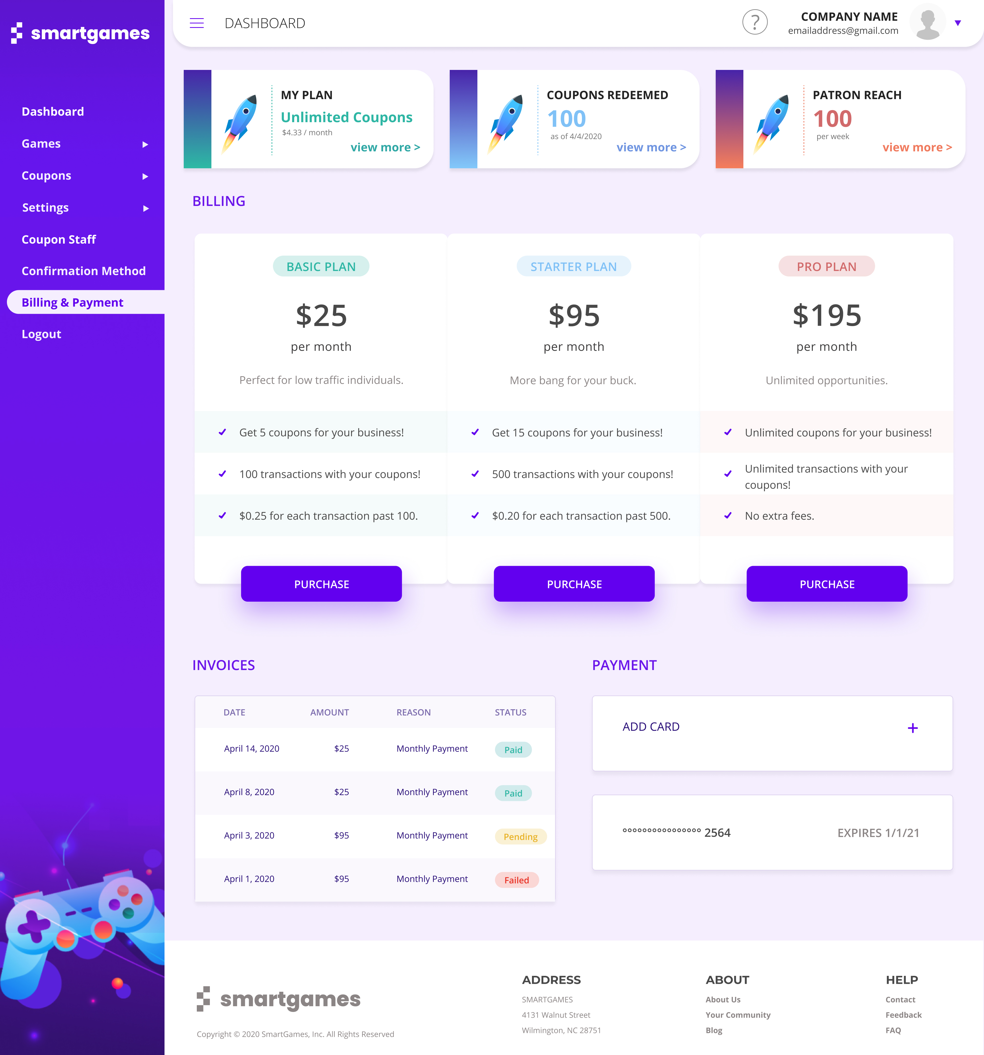
Surfaced three top-line metrics: current plan, coupons redeemed, patron reach, with twelve quick actions arranged as cards. Icons with labels. A 'Coming soon' badge on Game Maker manages expectations transparently.
Two takeaways
-
0 1
Help is part of the product, not separate from it
Integrating tutorials inline rather than building a separate help centre was both a design and a product decision, it raised feature discovery without raising support load.
-
0 2
Density is a design choice, not an accident
Admin tooling earns its complexity. The trick is choosing where complexity is visible and where it stays one click away.