FiberOne Broadband
A complete redesign of a Nigerian broadband self service app and website.
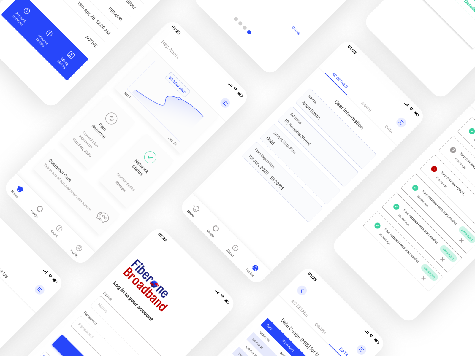
The context
FiberOne is a high-speed broadband service that offers fast internet at low cost. Their app should let users do everything a broadband customer needs: check usage, renew plans, pay bills, and get support, without ever picking up a phone. It didn't.
The existing app had unclear navigation, unlabelled icons, a punishingly long renewal flow, and a customer support path so confusing that users called instead of using it. I redesigned the experience end to end, alongside the marketing website.
The issues weren't subtle
-
0 1
Navigation was unclear and inconsistent across surfaces.
-
0 2
Icons were unlabelled, forcing users to guess at meaning.
-
0 3
The renewal process took too many steps for the most-used action.
-
0 4
Basic tasks were always difficult, with friction at every turn.
-
0 5
Reaching out to customer support was confusing and unguided.
-
0 6
Information architecture was fragmented and didn't reflect customer mental models.
The redesign in one list
-
0 1
Fixed a bottom navigation tab with clear icons and labels.
-
0 2
Introduced new icons with text labels to eliminate guesswork.
-
0 3
Simplified renewal into the minimum number of steps.
-
0 4
Redesigned basic tasks to feel simpler, and a little more fun.
-
0 5
Made reaching customer service clearer and more human.
-
0 6
Restructured information architecture so the app feels predictable.
How I worked through it
-
0 1
Anchor the experience with clear navigation
Implemented a fixed bottom navigation with labels so the app felt predictable, with confident movement between billing, support, and account.
-
0 2
Turn renewal into a visible goal
Moved plan renewal onto the home screen as a dedicated flow, making the task obvious and reducing the steps needed to complete it.
-
0 3
Make support feel human and accessible
Redesigned customer care wording and flow so users felt supported rather than lost, turning support into a usable product feature, not a dead end to a phone call.
-
0 4
One product, every surface
Redesigned the marketing website alongside the mobile app to share visual language, copy voice, and information architecture.
Three takeaways
-
0 1
Listing the problems is half the work
I started by writing every single thing wrong with the existing app. The act of enumeration surfaces patterns you can't see when issues stay in your head. I now do this for every product I inherit.
-
0 2
The most-used flow deserves the most attention
Subscriptions and renewals are the boring, repeated, every-month task. They are also the highest-stakes UX moments in a broadband product. The hierarchy of attention should match the hierarchy of use.
-
0 3
Tone is a feature
'Talk to one of our customer care agents' isn't decoration. It's the difference between a user trying the path and a user calling support. Microcopy is a product decision.