Human Resource Management Platform
An HR platform designed to simplify processes including team management, directories, recruitment, and leave workflows.
The context
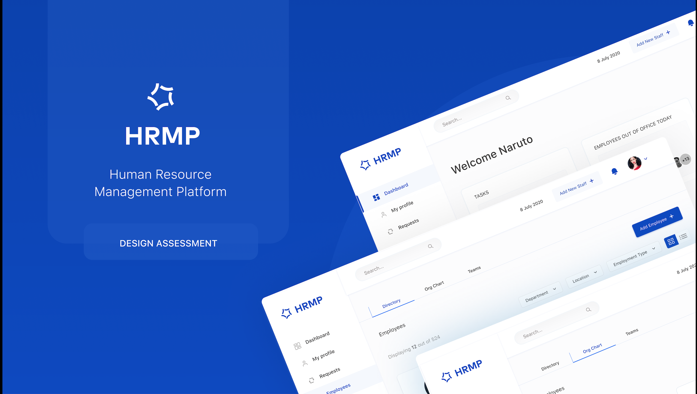
An end-to-end product design exercise for an HR platform serving mid-sized teams. The goal was to design a full HR management platform, a category traditionally defined by clunky enterprise software that HR teams tolerate rather than enjoy. The brief was open: design something people would actually want to use daily. Using this brief, I scoped the project to focus on three key areas: team management, leave workflows, and recruitment. I designed a system that could scale to other HR processes, and one that reduces HR overhead and gives managers clarity over their teams: directory, org chart, leave, recruitment, having them all in one place.
Why existing tools fail
Existing tools force HR managers to bounce between spreadsheets, email threads, and rigid legacy software. Daily tasks like approving leave or tracking onboarding require too many clicks and offer no single source of truth.
HR teams are not the loudest users in the org, but they spend their entire day in these interfaces. The bar should be consumer-grade, not "good enough for internal."
Three views of one dataset
-
0 1
Teams view
A new manager wants the org chart. HR ops wants a filterable directory. Project leads want team groupings. I built all three as tabs over a shared dataset, filterable by department and location.
-
0 2
Leave requests
Three tabs (new, old, calendar) with filters by month, status, and department. Status pills use colour sparingly: green for approved is the only saturated colour on the page.
-
0 3
Recruitment
Skills, work experience, contact details, and CV in one panel. Message and View CV are the only two primary actions, because in that moment those are all that matter.
How I worked through it
-
0 1
Design system first
Established colour, typography, and spacing tokens before any individual screen. Once the system was in place, building consistent screens became significantly faster and more scalable.
-
0 2
A single signature colour
Anchored the visual identity around a deep blue palette, supported by neutral whites and greys. Saturated colour was reserved for moments where status, urgency, or feedback genuinely needed attention.
-
0 3
Generous whitespace
High-density information doesn't have to feel overwhelming. Whitespace creates clarity, guides attention, and reduces cognitive load. The workflows are complex; the interface shouldn't be.
Three takeaways
-
0 1
Information architecture is product strategy. Deciding what becomes a tab, a filter, or a standalone page is one of the most important decisions in enterprise design.
-
0 2
Different views of the same data can become a product advantage. Directory, org chart, and team views are perspectives on the same dataset, not separate features.
-
0 3
Enterprise users deserve consumer-grade experiences. People spend a significant part of their day inside these systems; thoughtful design has a direct impact on productivity and satisfaction.
Context
HRMP was a successful design assessment and not a shipped product. I included it because the design thinking, system, and prototype work are genuinely representative of how I approach enterprise UX problems.